
Social media and the quality of online content is making visuals a currency we all deal in. As Jeff Bullas, 2018 Forbes Top 20 Influencer of Chief Marketing Officers, states “Photos are becoming the universal language”.
Whilst this statement was made about consumers, it’s also applicable for marketers and researchers. Success measures on the delivery of content from these groups are directly impacted by how well they grab attention and tell a powerful story.
Moreover, the absorption of a visual over text holds a lot more weight to marketing and research than just gaining attention. Visuals are processed 600,000 times faster than text, according to a 3M study. Seemingly this is an engaging technique, but it’s important to apply the right visuals to amplify the power they can have.
Recognising this, Kantar has been actively exploring the area of visuals in the data collection and marketing sphere. Our research and findings include;
- Research on research across hundreds of experiments around the use of icons, imagery, charting and infographics
- Results of advertising evaluation work with flash testing and rating
- Aesthetic acceptance and what consumers find good taste to be
Here are the key takeaways from three of our experiments. 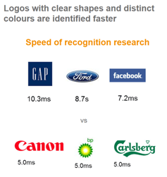
- We use shape and colour to process visual information
- When we are looking for information simple, literal images work best
- But these same visuals don’t work when information is selling itself to us
- We notice the first and the biggest
- We notice what is different
- We are subconsciously altered by human faces, red objects
- To cut though visuals, have to ask a question and challenge our minds
- What we take notice of and what we like are different
- What we like is based on aesthetic judgement
- Out sense of aesthetic is honed buy what we find familiar
- Out tastes are cultural
- For visuals to be effective, the information the visual delivers must be rewarding
- Essentially that information must be new
- The combination of information and visuals needs to make people feel something
- For people to share visual information it has to represent “brand me” and build “social capital”
- Each piece of communication is the advert for the next piece of communication, repetition kills of curiosity to consume more
If you're interested in the complete research, watch the full webinar hosted by Jon Puleston and myself here.